One year have already passed and IFFS 2014 is here once again! This year the trade fair is much smaller as compared to last year's trade fair. But.... the size do not matter as 2014's trade fair was much more better than 2013's trade fair. Based on the layout and design items that were exhibited there.
 |
| Designers Field |
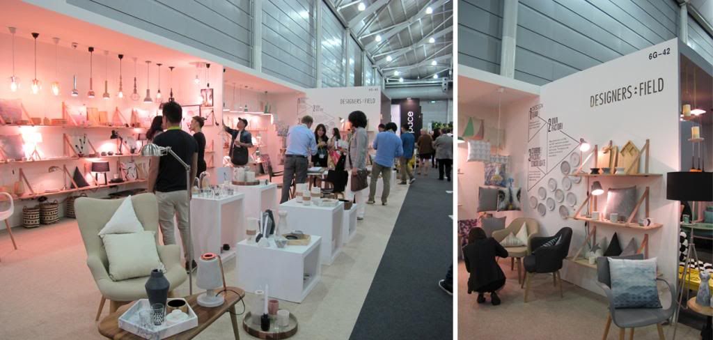
Came across this booth, the Designers Field. Their booth had gotten bigger as compared to the past year in IFFS. Designers Field is a Thai/Danish company located in Bangkok.
They design, source and produce home interior- and furniture products.
I really love their products, especially those lightings and home decorative products.
I am sure you will love them as much as I do! Take a look at their product in the website,
Designers Field.
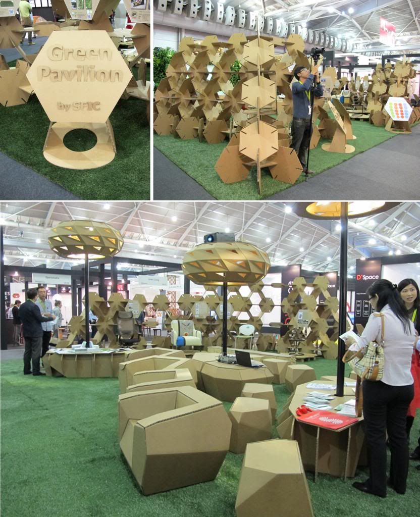 |
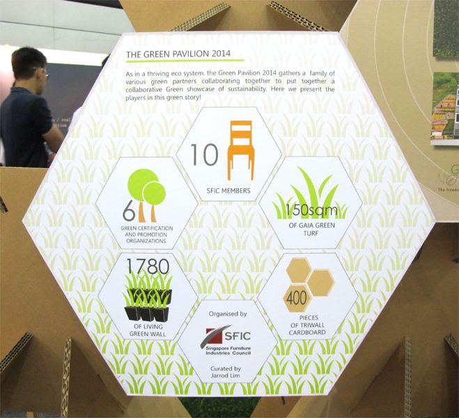
| Green Pavilion |
The Green Pavilion brings the attention to the concept of sustainability in the business environment, in the form of a “Garden”. It will be a key attraction to inspire and provoke the thinking process of moving towards sustainability in businesses.
 |
| Do you guys remember the winner for FDA2013? |
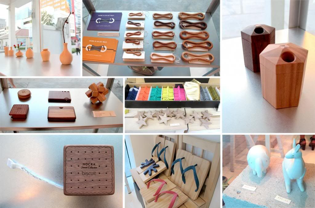
Here are the platform exhibition by some of the schools. Its much more interesting as compared to 2013's platform exhibition. Their spaces were much more open compared to the previous years allowing more products and furnitures to be placed in a tight space. I enjoyed walking around looking at what new upcoming designers have created as well as what might be the new furniture trends.
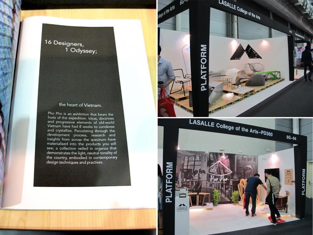 |
| Lasalle |
 |
| Nanyang Polytechnic |
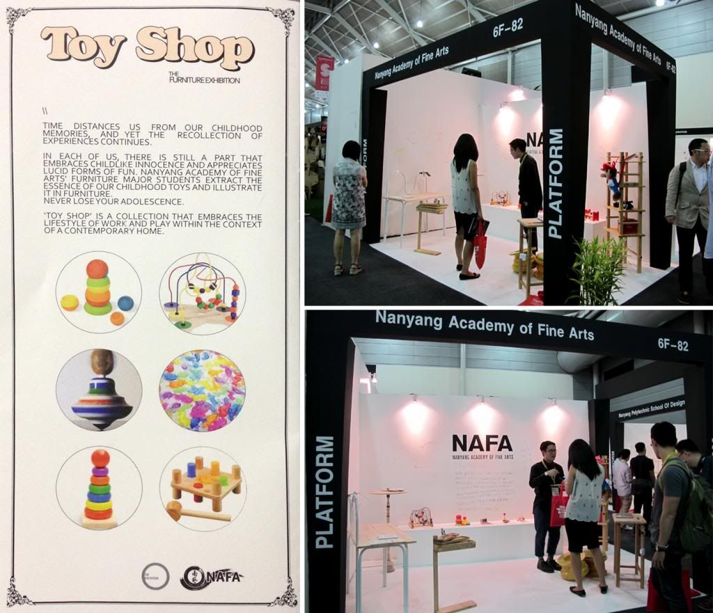 |
| Nanyang Academy of Fine Arts |
And of course, our alumni school. Their concept this year was much more playful and brings back memories to the childhood times. I think the product students did a great job with their finishing as it was much better compared to last year's batch. Good job and keep it up!
 |
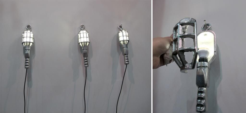
| Studio248 |
Stepped into Studio248' booth, I was immediately attracted to the quirky and lovely products. Some of their items are also being sold by Air Division, like the shelf you saw in the picture above.
Take a look at the lamps hanging on the wall, it was i think casted in metal and the front cover can be easily removed by just pulling it off as they were attached on by magnets. So it will simply attach back firmly when you place it back. I called it the "Iron Man lamp". HAHAHA...
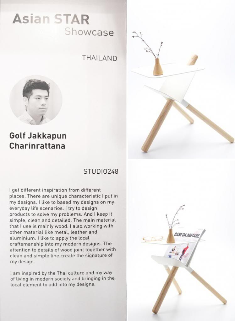 |
| Golf Jakkapun Charinrattana |
Our most favorable piece in the booth was the Three-legged magazine table that can be
used as a side table as well. This really cute and unique piece that can be dismantled and flat
packed. Golf a humble designer from Thailand was the one who designed this magazine
table, you can view more of his designs at Golf-JC.
- Pickers
Labels: Award, Bench, Chairs, Craft, Design, Exhibition, fair, Furniture, Furniture Design Award, IFFS, new, photography, Platform, Product Design, Products, Singapore, store, street picks, Studentworks, Wood
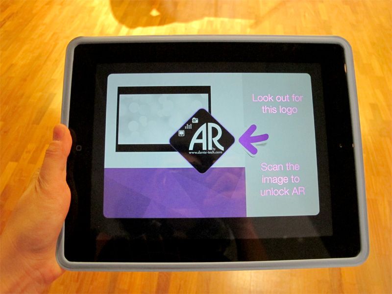
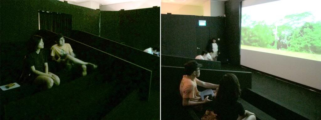
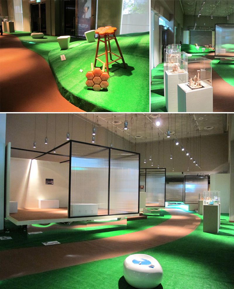
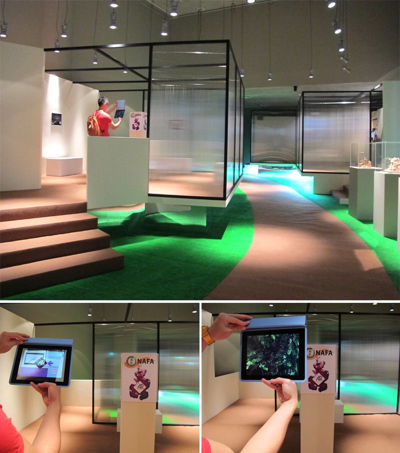
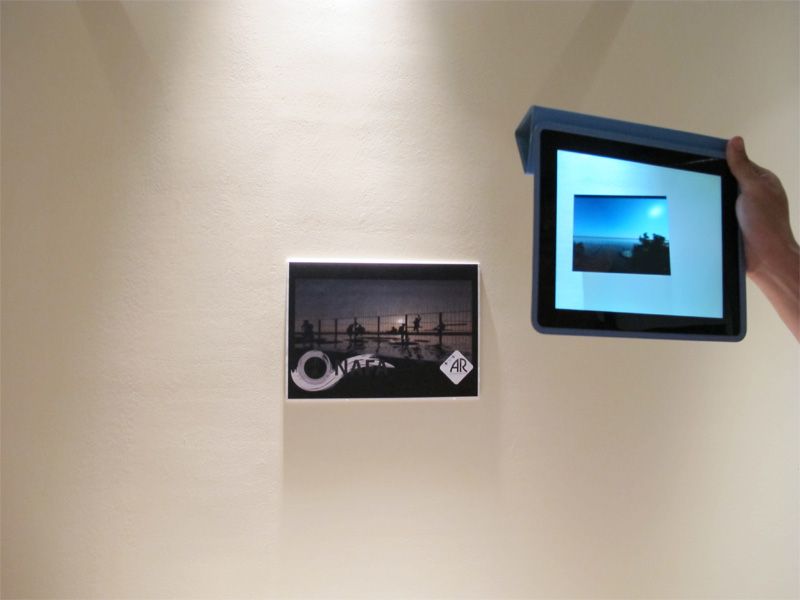
Bestowed with an Ipad, but we were unsure of its purpose. We were told to look out for barcode and have them scanned for something really special. So we thought it was like searching for Wally but it on a different level.
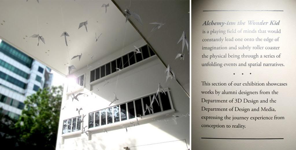
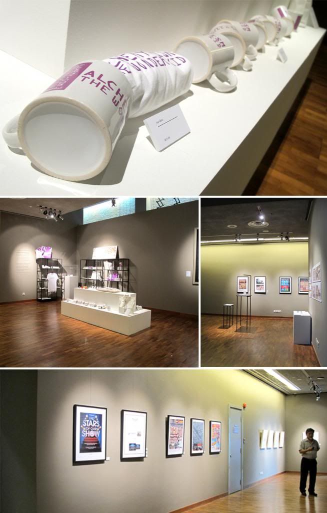
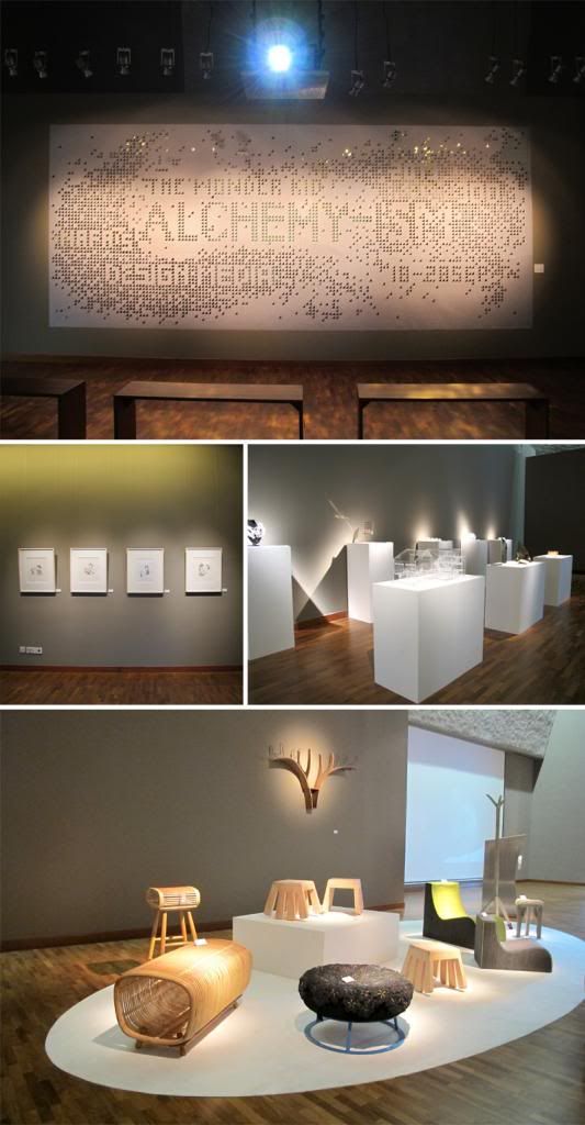
On the same day, which we went to 8Q to gather information on the plates, which we had posted awhile back, we went to NAFA first to visit an exhibition held by both the Design and Media Department and the 3D Department. It was an exhibition whereby I would describe it as “Art meet Science”. The artistic flair and finesse touch of graphic design cross with the logical and practicality of furniture making. So maybe that was why it was named Alchemy-ism, it required precise measurement, creativity and innovation to cook up a mysterious concoction like those works that were displayed.
When we were given a tour by one of the alchemist, we were awed by that the main part of the exhibition was actually behind the screen.
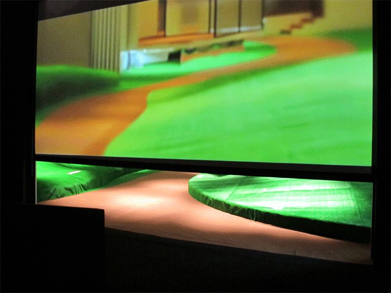
Ok, ok maybe I was too excited to describe that part but the screen was playing the introduction of what the whole exhibition was about. And it just ended abruptly with a girl running beyond the yonder and we were like what? But it was meant for us to continue with the rest of the girl’s journey.
(Caught us slightly off guard there!)
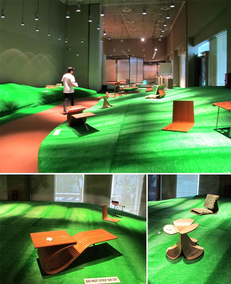
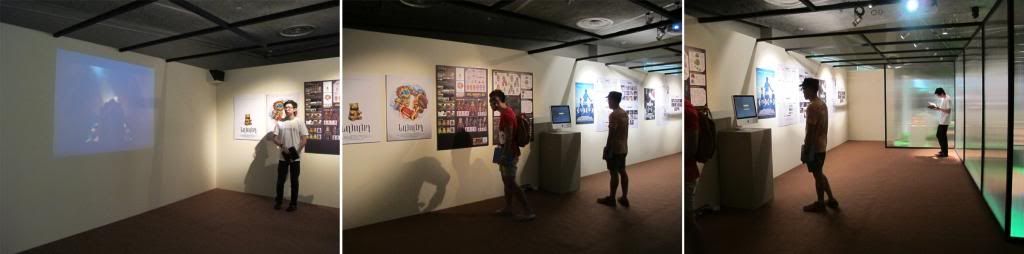
As we carried on with the journey, we started off with the "Science" part of the exhibition, works made by former apprentices who were still learning the craft of furniture making then. Though they were made years ago, the furnitures were still looking sturdy and fully functional and not to mention that they still look modern despite going through the passage of time.
The petal looking stool was the one that really caught my eye. It reminded me of the Butterfly Stool, by Sori Yanagi (1954-2011). Simple pieces of plywood manipulated to form something beautiful.
The end of "Science" part of the exhibition brought forth the "Art". We were given a treat of the endless ideas inside the mind of the digital alchemists. And also, we had unraveled the true purpose of the Ipad, the moment we scanned the barcode. A video suddenly appeared before us. It was pretty cool. Real high tech stuff there.
Further back in, was short clips and their story boards. Those clips was very interesting, especially the one with the golden gummy bear. And two others that were very deep and intense. They have won several acclaims from the prestigious crow bar award(if I have remembered correctly.)
Overall the entire exhibition was very good, interesting and well curated. Throughout there isn't any drop in climax, we were totally impressed till the very end. Very well worth of our time, and beside this isn't the first NAFA managed to do up something this interesting. Looking forward to their next exhibition in October. Good job NAFA!
- By Pickers
Labels: Alchemy-ism the Wonder Kid, Craft, Design, Exhibition, Furniture, graphic, Interior, NAFA, Product Design, Products, Singapore, Studentworks, Wood
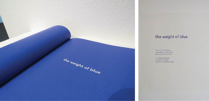
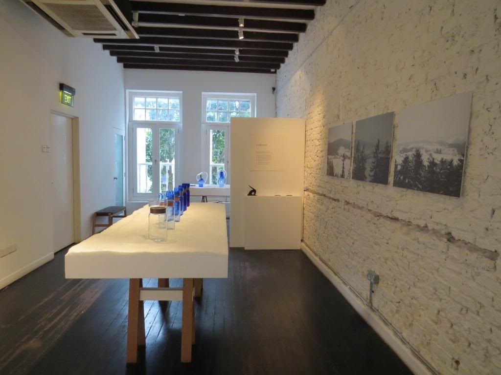
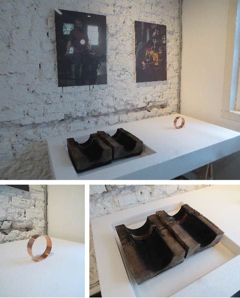
Today was the starting of the exhibition The Weight of Blue by Outofstock X Freiherr vonPoschinger Glasmanufacktur, a 450-year old glass factory in Bavaria, Germany. The exhibition was held at The Workshop Gallery.
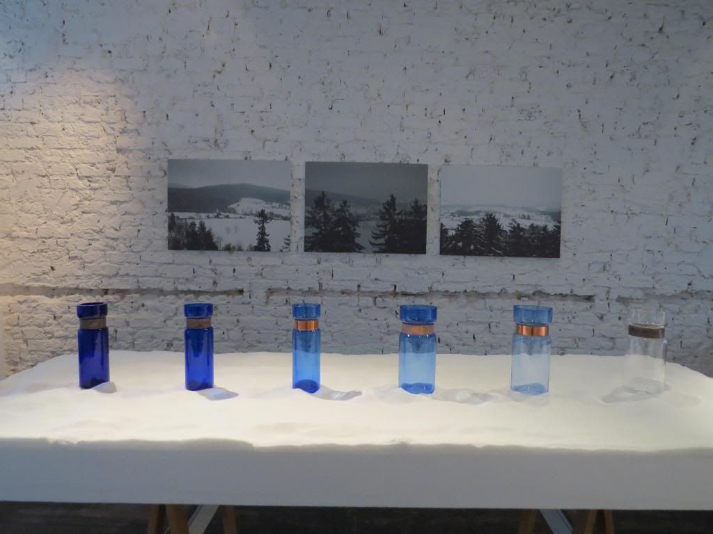
The exhibition is about a set of vases called 'Captured' in different shades of blue. How long does it take to master the color blue? Well, it took them about 25 years to master it...
The blue pigments are defined by their weight measured roughly by hand. Unlike having it in a specific shade of blue like pantone colors, these are all base of intuition, and all the vases would not turn out the same shade of color. The metal band around the vases were incorporated from outofstock's previous exhibition 'Living textures' last year. Mixing metal and glass together brings out a even balance between the hard and soft, as metal has that edge and glass seems very fragile.
The metal ring around the vases and the mold that was used to shape the vase.
The vases, though they may have the same size and shape, the glass thickness are different base on how much air was blown into the vase and how much crystal particles were used.
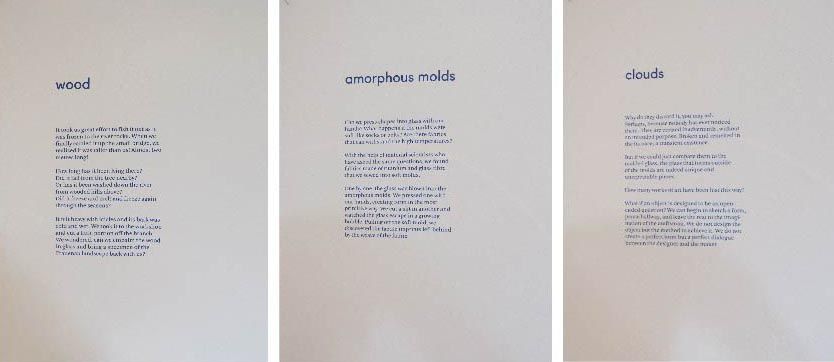
There were also some experimental pieces that used different texture cloths and shapes to come about. Experiments were about finding out if they were able to press shapes into glass with hands, which materials can stand the high temperatures and also trying to embalm wood in glass.
All the experimental pieces were unique in their shapes, size and forms. Some had the '
texture of the cloths that was used to form the glass, others had burnt branches in them. it was super unique and interesting!
We do suggest you drop by yourself to look at the vases. its an exhibition not to be missed!
12.00 noon to 7.00pm daily
Labels: Craft, Exhibition, Germany, Glass Blowing, Metal, Outofstock Design, Product Design, Singapore, The Workshop Gallery, Vases, Wood
Continuing from the previous post, we made our way to S*cape to check out the Furniture Design Awards 2013(FDA), the 20th Anniversary for FDA and also other exhibitors.
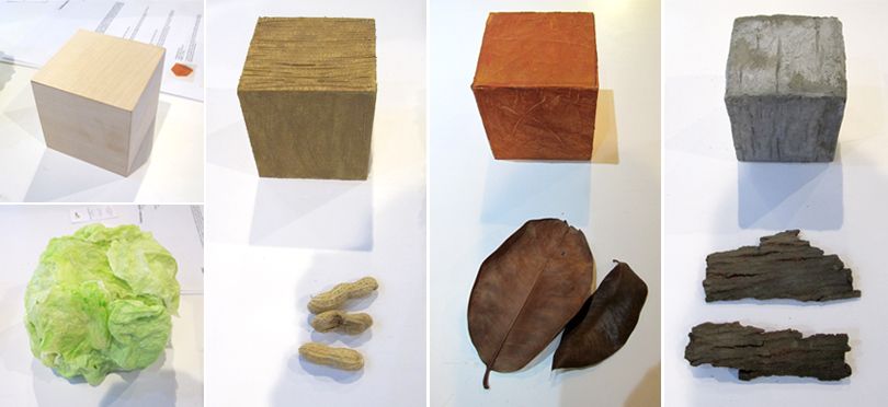 |
| NAFA's 2013 Product Design Students |
|
NAFA have another booth at S*cape where their product design students create textures from items you can find anywhere. One of the more unique one is the cabbage look alike! But do not be fooled, the student used tissue paper, PVC glue, water and paint to create this.
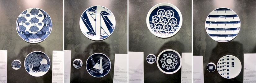
Another exhibitor there was no stranger to our blog, was S U P E R M A M A. Their new collection and a new collaboration with Kihara a Japanese ceramic label called Democratic Society X Kihara Part 1.
Yes
its part 1, cause they are holding a competition now to design the next
plate that they are going to produce 200 pieces to sell! Dateline is
31st March 2013! so hurry get creative and send in your designs! All the designs you see here can be purchased at S U P E R M A M A at SAM 8Q.
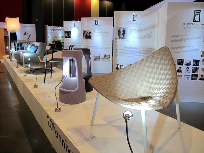
FDA Competition & 20th Anniversary for FDA
Furniture Design Award (FDA) 20th anniversary showcase of past winners.
The Furniture Design Award or otherwise known as the FDA. It's every challenging, an every up scaling task for designers. It questioned the role of a designer and makes one thinks deeper into the problem that are affecting lives around us. Today designers are no longer elusive or eccentric that only care about works of beauty, but answering the calls of global problems. And as furniture of today can no longer serves their main function beautifully but to also coexist in our limited environment.
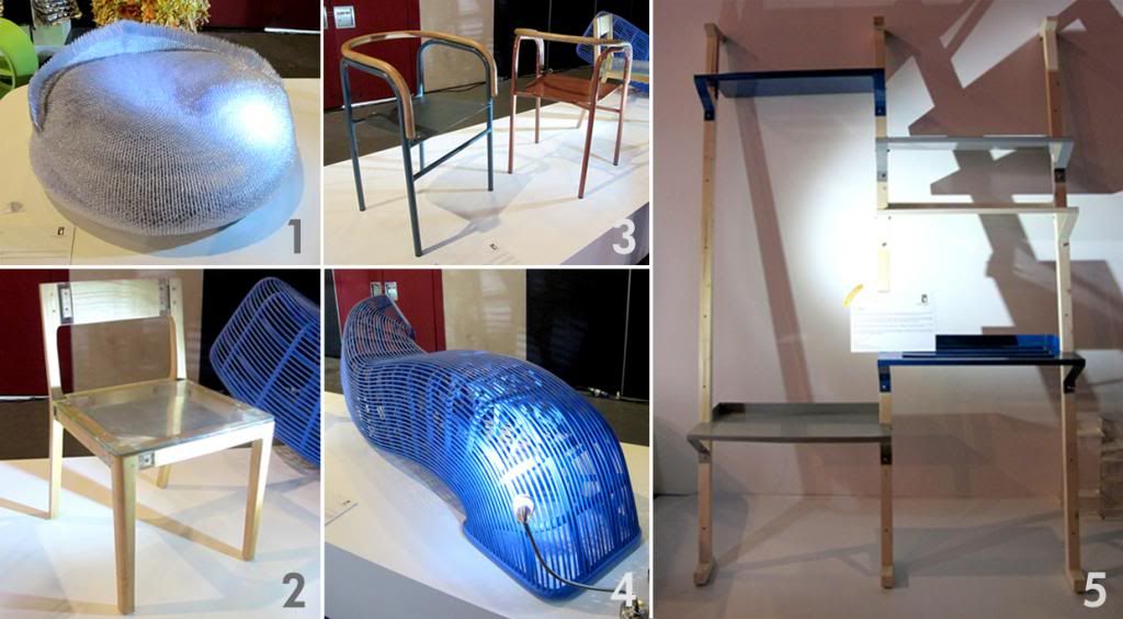
The works above are the 5 finalist of the student category, they have applied design to what they have experienced to solve the problems of what the modern world face today.
1: The Uni armchair by Wendy Kokaish from Nanyang Academy of Fine Arts.
United we stand, divided we fall. It mentions of that no man is an island, and in order to succeed we need to work together.
2: Exploded
Chair by Denny R. Priyatna from
Bandung Institute of Technology.
Reminds us that no matter how advance
technology has improved. It will always required a skill crafts man to
turn the raw and undefined into a piece of product. The deliberation of
using clear resin for the back rest and sitting is to allow the user to
see the most important part of the chair, the jointing method.
3: Common Armchair by Diaz Adisastomo from Bandung Institute of Technology.
It is made of aluminum and rattan. Despite the differences in the type of materials, they both share the common traits of being light-weight, strong and flexible. Diaz was inspired by the similar characteristic and background of these 2 materials and hence, Common chair.
4: Pipe seat also by Denny R. Priyatna.
Intrigued by how pipes run through the wall, holes and even underground and even places unknown. Based on that fascination, Denny used rattan and iron pipe to translate that idea into something surreal. It is designed to look like it has no end and even connected to the next room, it is highly adaptable by being able to rotate and be used anywhere. By having it placing next to a wall, greatly increased its value in concept.
5: Co-Axis by Patpimon Onplui of Silpakorn University of Thailand.
It addressed the problem of modern home today of having limited space.
Co-Axis is a series of versatile shelving system, that is based on the concept of living together by sharing the same part and taking up little space. To answer to the need of each users, the aluminum shelves are highly adjustable. Co-Axis also come with a clothes and trouser racks and it is user oriented and easy to assemble as well. Not only that, the aluminum shelves comes in a wide range of colors to the owner's delight. Purple and Orange for me. :)
The works above are the 5 finalist of the designers category
1: Gong Shelf System by Min Chen is a modular formulated shelving system
which consist of 3 metal sticks that are vertical to one another. This
feature allows the shelf to be build and fit into any place or
environment. Plastic or metal board that are cut to size can fit
in-between the stick to allow the user to put their object above it.Not
only that, Gong shelf system enables the user to completely customize
it and it leave behind is an unfinished image of an architecture still
in progress.
2: Shoehorn Umbrella designed by Sim Miao Ling
stand was inspired by the concept of "organization" which is an
essential part of our daily life, It is a man's way of keeping things in
order. But at the same time, being too organize may result in missing
out on certain things. The idea of this design is to create a new
perception and new values of organization. Sim Miao Ling observed how do
one organized things and seek our new possibility of what can or cannot
be organized. Miao Ling also described that how object are placed based
on their associated surrounding, or are placed as a result of the
transitory human's behavior. The ShoeHorn Umbrella stand is inspired by
how this 2 object, the shoe horn and the umbrella stands beside each
other near the door. The multiple curved edges of the umbrella stand
allow for a single shoehorn to blend in quietly. Flat disc magnet ensure
the shoe horn snaps back into place and stays there.
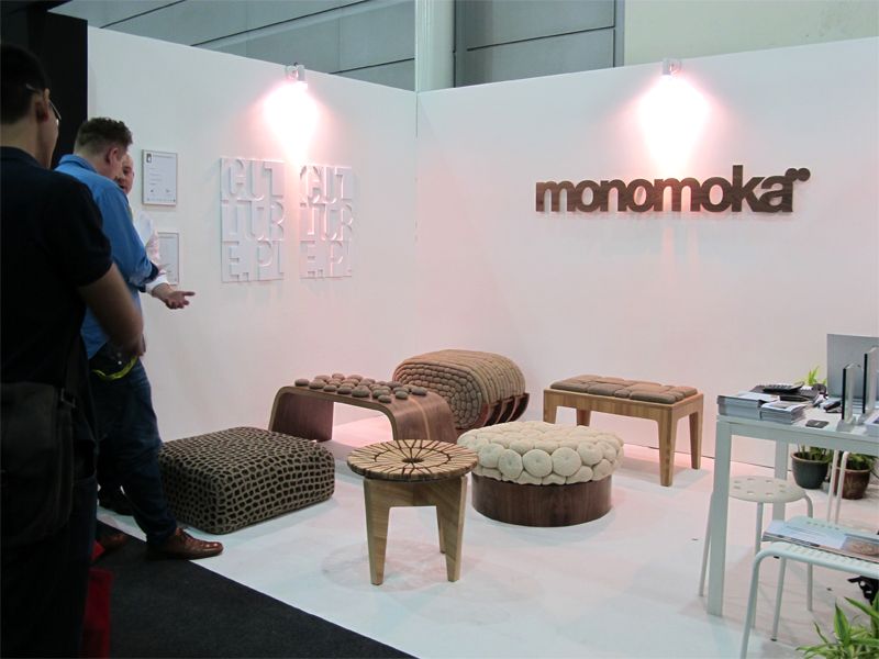
3 and 4: Artichoke and Hive, crocheted cushions designed by twin sisters Kasia
and Monika Gwiazdowska, But in Singapore the designer sisters is
represented by their business partner Piotr Saladra. Both the Hive and
Artichoke were made by MONOMOKA furniture, and also from the same
materials of 100% natural linen or any recycle twine.
Despite the
many similarities between this 2, Hive was made of of 1,600 pale grey
crocheted linen shapes and Artichoke was made of 156 crocheted orange
and yellow polyester shapes. And when we gradually think back on how the
Artichoke plant looks like, and then their natural color of green.
5: Genterie and Nouveau by George Soo, described that the luxury crowd is becoming younger and savvier, and that whether wealth that are made or through inheritance. And with that success , comes an underlying existentialist angst and increasing social consciousness reverberating amongst a new luxury audience. Genterie and Nouveau was design based on the concept and expressed it through the consideration of material choices and dimension. And the decision down to the very last fabrics of the cushion is also taken into detail and consideration.
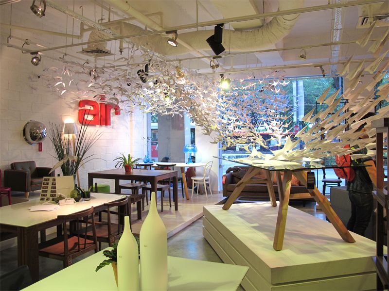
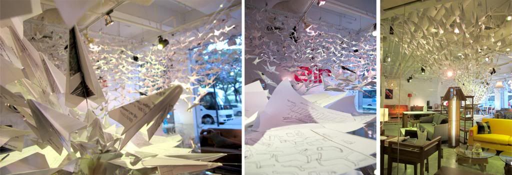
48 Hour Challenge
Winner of the 48 hour challenge: Air Division X Nafa Collaboration
This year, 5 retailers will be working with students from
design institutions to innovate, revamp and reinvent their showrooms
within 48 hours! and the finishing look for all the showrooms are truly remarkable in how much work they put in for just 48 hours~
The 5 participating retailers and schools are:
Acanthus X Lasalle
Air Division X Nanyang Academy of Fine Arts
Furniture Club X Inspiration Design
Jesprit X Temasek Polytechnic
V Furniture X Nanyang Polytechnic
NAFA students folded a total of 1500 paper cranes, and 1500 paper planes using recycled paper in 48 hours!
We thought that the Air Divison X NAFA design was the most creative, and we are not just saying that cause we are from that school, but the materials used were recyclables, so didn't have to spend money at all, and no wastage.
-By pickers
Labels: 48 Hours Challenge, Chairs, Craft, Design, Exhibition, Furniture, Furniture Design Award, Platform, Products, Singapore, Wood
 |
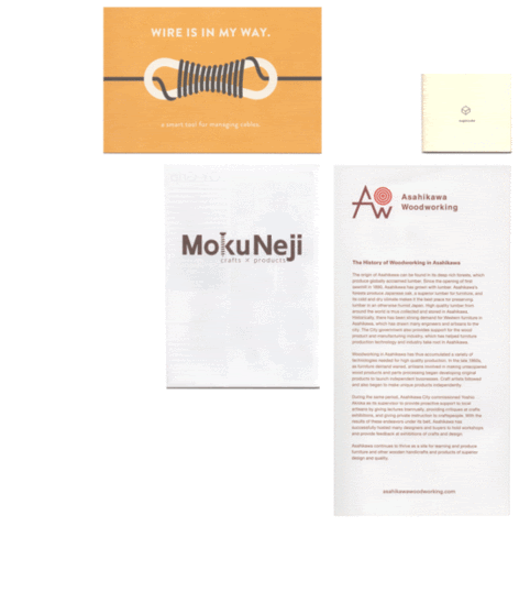
An Exhibition & Launch of Ono Rina's New Works & Asahikawa Wooden Wares
|
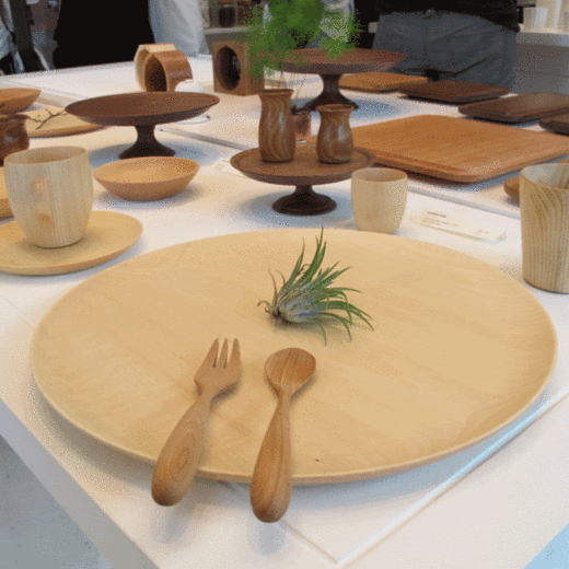
During the weekend, we were invited to 8Q @ the Singapore Art Museum, for an exhibition called ISSHO - Together. That was curated by Supermama, a local design studio.
We were immediately drawn to the wood works that were on display. The products were made to Japanese standard of clean lines and simplicity. They were so well crafted, that we were told that are customers who questioned whether these products are usable.
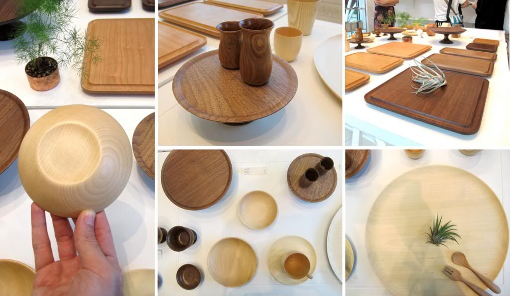
The highlights of the exhibition were tables wares made from commonly used materials in various production methods.
Wooden tableware were a mixture of designs by Ono Rina, Oji Masanori and Takahashi Hidetoshi.
 |
| Ono Rina |
Cara series by Ono Rina, is a series of delicate "egg-shaped" goblets and plates combines whittling techniques to create very thin sides and the natural warmth of wood. The soft curves of tablewares in the series, made with Hokkaido - grown linden, fit naturally in one's hand.
Our thoughts:
We felt very familiar to the wood that our first reaction was to feel it. The thin sides and smooth surfaces were so well crafted actually made us wish that we have the craftsman skills of precision.
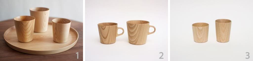
Another set of wooden tableware were the Kami series by Takahashi Hidetoshi and Oji Masanori. This series of mostly drinking vessels is made from sen (castor aralia) trees using a lathe. The items in the series are thin enough to allow the light to pass when held up to a light source, and hence the name kami (paper). The sides of kami cups are only about 2mm thick. The feel of wood on one's lips is very warm and gentle.
Our thoughts:
Coming from a design school, we had a chance to use the wood lathe machine ourselves, and there was a limitation on how thin it can go before breaking off and having to redo it over and over again. Patience, skills and experience are definitely needed for this...
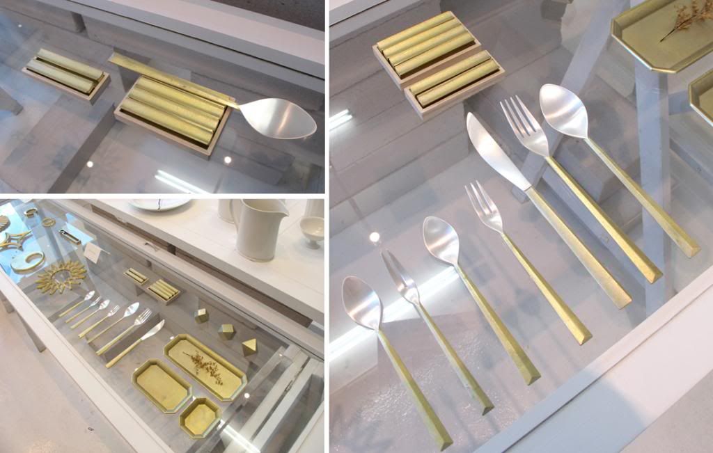
Futagami Cutleries
Another great design by Oji Masanori is the Futagami cutleries set made with a strong contrast of body of gold and a silver head. The cutlery rest also called the shooting star or Ryusei in Japanese, proves to be a wonderful design pleasing to both the senses of touch and sight. Made with an IHADA finished, or crude casting surface. Due to this nature, the body will go through a transformation of colors, due to oxidization. And not only that, through constant usage of it, the richer and subtler the body of the cutleries become.
The silver coated head of the cutlery set when put in one's mouth, has been proven antibacterial and has no metallic taste or smell but is also hygienic and beautiful.
Our thoughts:
When we first set our sight on the cutlery set, we were so drawn into it. The golden rough texture of the brass body and the smooth silver head proved to be a match made in heaven. The technique used give the users a different sense of touch as well as made it look unique.
Design is never dead, is ever evolving. You can always teach an old dog some new tricks.
By Pickers..
Labels: Craft, Design, Exhibition, Japanese, Products, Supermama, Tableware, Wood